

First off, I hope you have an idea of what your season is and if you haven’t done so, book your color consultation or sign up for my FREE Color Course. Now let’s take a look at some amazing color palettes images (and only one of the seasons contains black — gasp!).
Neutrals
Let’s look at neutrals, these are blacks, whites, grays, beiges, camels and browns. Although black and stark white are the most available colors in the market, they are not the best choice for many skin tones. Many people who use them as a base for their wardrobe could do so much better. Wearing blank and white, if they are not the right colors for you, can leave you looking drained and tired. As women, we have enough going on in our lives to ACTUALLY BE drained and tired, but we don’t have to look it too. Wearing the correct colors can make you look vibrant, well rested and more alive.
My “AH-HA” Moment
One morning, more than 4 years ago, as I was getting ready for work, I was looking at myself in the mirror before I’d put my makeup on. It was the first time looking at myself that I actually thought I looked old and tired. I had dark circles under my eyes and the lines around my eyes and mouth were very pronounced. I was wearing a black blouse that I’d worn many times before.
This was a very eye-opening experience for me. This was the first time in my life that I realized that the color I was wearing were not making me look my best. Black had been the foundation of my wardrobe my ENTIRE LIFE.
The Fallacies of Black
I know I’m not alone in this. How many of you were taught the following?
- Black goes with everything
- Black is slimming
- All your basics should be in black
- Black shoes are the staple to any wardrobe
I could go on and on with more of the falsely bestowed accolades of black, but I won’t. I’m sure many of you are finding this hard to swallow, turning everything you think you know or have been taught upside down. I might make some enemies here, but not all of you who are reading this blog right now are putting your best foot forward by wearing black. There are so many other better options for Springs, Summers and Autumns.
Put It To the Test
If you don’t believe me, do your own little test. Tonight, after you take off your makeup, stand in front of the mirror and put a black top on. Does your face look better? Do the lines, wrinkles and dark spots diminish or look more apparent? Now try a different color, a brown or a charcoal, a red, navy, just something else. Experiment with other colors and observe the effect they have on your complexion.
I’d love for all my readers to try this and let me know what you discover. Were you surprised? The truth is there are other colors that DO go with everything. Black can be slimming, but sometimes can make you look larger. Dark colors, in general, are slimming, not just black. Basics can be in any neutral. On top of all that, you can live and be really well-dressed and put together without black shoes. I’ve been doing it for more than 3 years.
Black IS Beautiful on Winters
Winters wear black perfectly. It makes their facing even more stunning. If black is not one of your most becoming colors, then you are one of the other seasons. Some seasonal color analysis experts say that you can wear black if your season blends with winter. I’m not ready to give a green light on that unless I drape you personally. Since my season blends with Winter, some would have said that I could wear black and honestly, I could when I was in my twenties—before I actually had any wrinkles.
Now I can honestly say the color has a negative effect on my appearance. This realization is what lead me to research seasonal color theory. This is the experience that changed how I view color and am now able to use it as a tool to put my best self forward. For this reason, I want to help other women discover the colors that look best on them as well.
Picking a Basic Neutral for Your Wardrobe
Does black go with everything?……No. “What?”, you may say, “Of course it does.” The same fashion magazines and articles that tell you black goes with everything, in the same breath, will tell you not to mix black and brown. Why not replace your black with another neutral like brown, khaki, camel, or charcoal? Or replace it with a basic color like navy or olive. These color choices create much more interesting palettes anyway and are more versatile than you think.
Ever since my “ah-ha” moment, I’ve been building my wardrobe around navy instead. Now, all the black I have left is one sweater, a couple of coats, some socks
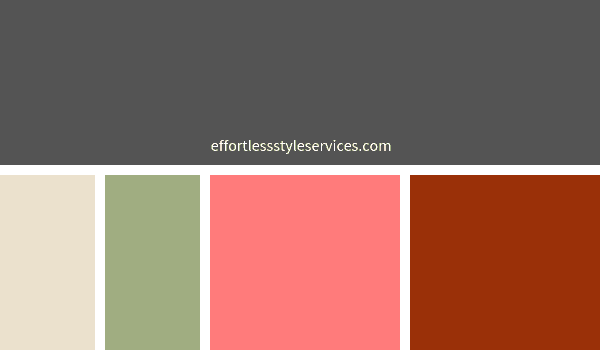
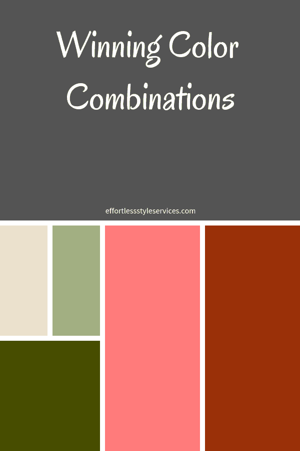
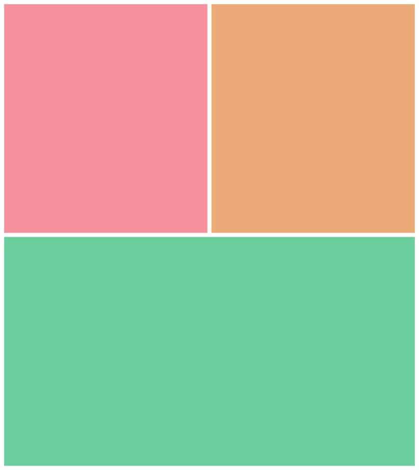
So. . . enough about staying away from black if it doesn’t suit you. What are some colors you CAN use as foundations for your wardrobe? Navy, along with olive, rust, and burgundy are some basic colors that can be used with a variety of other colors and can function in much the same way as we use neutrals. If you’re a summer, pastels can be used as foundational colors. Here are some example color palettes you can use (I know I’ve harped on black, but I’ve included it for my Winters because it does suite them perfectly).
Proportions
Just as there are a great number of color combinations, there are also numerous proportions to wear color. Before talking about specific color combinations, let’s discuss an art term that is often used to discuss proportion. If you’ve ever taken an art class or studied the Renaissance, you may have heard about the Golden Mean or the Golden Ratio. It is said to be the most pleasing distribution to the eye. The ratio of the larger segment to the whole is equal to the ratio of the smaller segment to the larger segment. For those of you that get Algebra it means that (a+b)/a=a/b. The ratio is a little more than ⅗, but less than ⅔.
Body Proportions and Color
Now stand in front of a full-length mirror and imagine dividing your body at the waist. If you are an average torso and leg length, then the ratio of your bottom half (waist to floor) to your total length is somewhere in the neighborhood of ⅗ to ⅔. The ratio of your top half (head to waist) is ⅖ to ⅓. These are also good proportions to strive for in your color combination as well. We’ll also re-visit the Golden Mean later when we talk about the proportions of our body as well, but for now, here are some examples of how this principle is used in our outfit choices.
Color Combinations for your Season
Wow! This was kind of a lot for one post. I hope that those of you that may have had your own “ah-ha” moment in front of the mirror with your black t-shirt are not feeling overwhelmed, but excited about a new adventure to explore other colors.
Spring Color Palettes Images


Checkout more great resources for springs here. Or follow the Spring section of my Color Pinterest board.
Summer Color Palettes Images


Find more fantastic resources for Summers here or follow the Summer section of my color board on Pinterest.
Autumn Color Palettes Images


This page is a great hub of information for Autumns. You can also follow the Autumn section of my color Pinterest board.
Winter Color Palettes Images


Additional resources for Winters can be found here. Follow the Winter section of my color Pinterest board for additional ideas.
In summary, no matter your season, there are amazing color combinations you can incorporate in your outfits to look amazingly stunning. When it comes down to it, you want people to notice you and not the colors you wear.
