

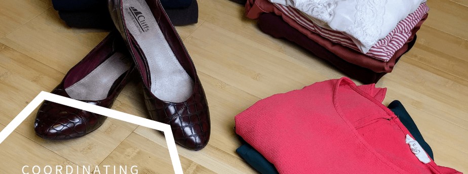
Color Palette
When planning a wardrobe, it helps to first create a color palette. You want something that will guide you, but not be too restrictive. It’s good to have some criteria and boundaries, but it is important to create a color plan that will work for YOU. Here are some suggestions of colors you can use to create your color palette:
- Any color found in your eyes. This includes the ring around your iris and all the individual flecks, spokes or squiggly formations. For example, the ring around my iris is a dark blue, almost black, I have rust colored spokes coming from the pupil and some areas of gold. Your natural hair color also makes a good addition to your color palette.
- The color of your lips will be a flattering color on you too. Basically, any color that you can select from your body will look good on you including the color of your veins and your skin color itself.
- Pick complementary colors to the colors you find on your body. As a complementary color to the rust color in my eyes, I selected a dark olive green as a basic.
- You can also just pick colors that you like that are within your season.
Getting Started
I suggest that you start with 10 colors. Add or take away to refine your color palette to a tool that works for you:
- Dark neutral
- Medium neutral
- Light neutral
- 3 basic colors
- 2-3 signature colors
- 2-3 accents or other neutrals
Furthermore, when choosing your signature colors, look for ones that represent something you want to say about yourself (see my color meaning post for some guidance).

Get Your Own Printable Color Palette Planner Below
Here is an example of my color palette. Because I think black makes me look tired, I now embrace alternatives to black such as navy, dark brown and charcoal gray.
- Dark Neutral -Body Harmony color- Dark Chocolate Brown- My hair color
- Medium Neutral- Warm beige
- Light Neutral- Cream
- Dark Basic- Navy- the ring around my iris
- Basic- Dark Olive Green- complement to the rust in my eyes.
- Basic- Deep Red Orange – Bold energetic, attention getting
- Signature color – Salmon – Soft, youthful and a little fun- (I prefer kind of a dusty version). It’s close to the color of my lips and looks stunning when combined with the navy
- Signature color – Blue – Calming and consistent
- Signature color – Purple – Independent- I just like it
- Accent color – Green- Complement to the same and the basic rust, monochromatic with the basic olive and analogous combined with the navy or other blue.
- Other Neutral – Camel – the color of the highlights in my hair.
- Other Neutral – Deep Gray
Cohesive Color
All your colors from your palette should look well together and easily mix and match. Notice how I noted the relationship of some of the colors to the others. This helps create a cohesive palette. You also want to vary the value of the colors.
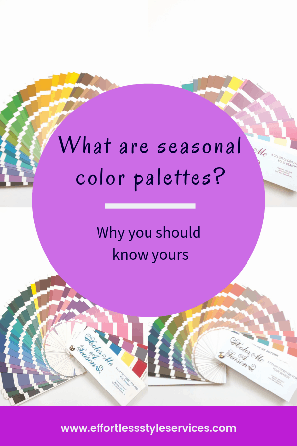
Because I blend with winter, I have a tendency to wear a lot of dark colors. I had to be sure and round out the palette with the softness of the salmon and the brightness of the green while being sure to stay within the colors of my season. I also include Autumn’s coral and a brighter teal for spring and summer time. The teal can also be worn in tonal or monochromatic combinations with some darker teal pieces that I own.
In conclusion, I’d love to help you define your color palette. If you live near 73533, visit my services page and book a color consultation today. Start with the Basic Color Consultation. It comes with the personalized color guide and color fan. If you don’t live in my service area, sign up for the FREE Color Course. My Color Pinterest board is also a great resource.